以前排版排的比较少,没有设计图的那种,我们后端一般都是用框架或者仿照样式,最近公司需要定制一个企业站,要还原设计稿。我在排版中大量用到了垂直居中与水平居中。
1,传统的水平居中(固定宽度居中),如一个div,宽1200
div{width:1200px;margin:20px auto;
}
2,水平与垂直居中,网上有很多种方式,我现在用的是这种方式
这个方法使用绝对定位的 div,把它的 top 设置为 50%,top margin 设置为负的 content 高度。这意味着对象必须在 CSS 中指定固定的高度。
因为有固定高度,或许你想给 content 指定 overflow:auto,这样如果 content 太多的话,就会出现滚动条,以免content 溢出。
<div class="content"> Content goes here</div>
#content {position: absolute;top: 50%;height: 240px; margin-top: -120px; /* negative half of the height */ } 优点:
- 适用于所有浏览器
- 不需要嵌套标签
缺点:
- 没有足够空间时,
content会消失(类似div在body内,当用户缩小浏览器窗口,滚动条不出现的情况)
我的项目中,有一个这样的版面,先给素材:

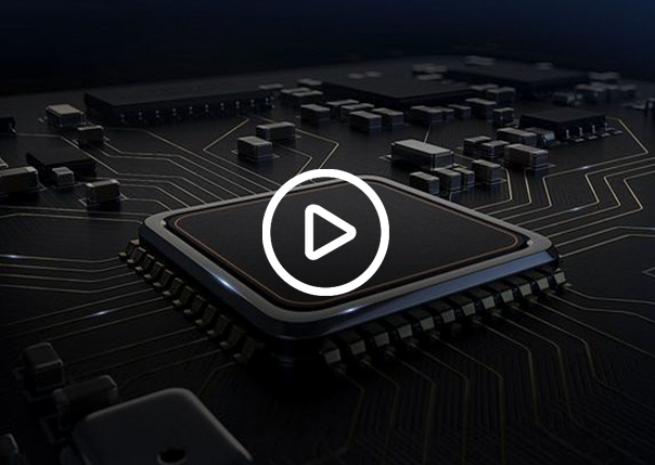
 需要实现的效果:
<div class="img"><div class="icon"></div></div>
.profile-bottom .c .img {background: url(../images/C-1.png) no-repeat;height: 429px;position: relative;width: 607px;cursor: pointer;z-index: 1000;float: left;
}.profile-bottom .c .img .icon {background: url(../images/C-2.png) no-repeat;position: absolute;top: 50%;width: 117px;left: 50%;height: 117px;margin: -59px 0px 0px -59px;cursor: pointer;
}